
Chapter 1 : Indroduction to Blzor WebAssembly
Chapter 2 : Building Your First Blzor WebAssembly Application
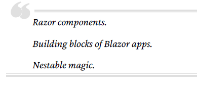
Razor components are the building blocks of Blazor WebAssembly applications.
A Razor component is a chunk of user interface that can be shared, nested, and reused.
Razor components are ordinary C# classes and can be placed anywhere in a project.
In this chapter, we will learn about Razor components.
We will learn how to use them,
how to apply parameters, and
how to create them.
We will also become familiar with their life cycle and their structure.
We will learn how to use the @page directive to define routing
and we will learn how to use Razor syntax to combine C# code with HTML markup.
Finally, we will introduce the Hot Reload experience.
The Blazor WebAssembly project in this chapter
will be created by using the Blazor WebAssembly App project template
provided by Microsoft.
After we create the project,
we will examine it to further familiarize ourselves with Razor components.
We will learn how to use them, how to add parameters,
how to apply routing, how to use Razor syntax,
and how to separate the Razor markup and code into separate files.
As we make edits to the code,
we will use Hot Reload to automatically update the browser.
In this chapter, we will cover the following topics:
• Razor components
• Routing
• Razor syntax
• Hot Reload
• Creating the demo WebAssembly project
Creating the Demo Blazor WebAssembly Project
Technical Requirements
To complete this project,
you need to have Microsoft Visual Studio 2022 installed on your PC.
For instructions on how to install
the free community edition of Microsoft Visual Studio 2022,
refer to Chapter 1, Introduction to Blazor WebAssembly.
The source code for this chapter is available in the following GitHub repository:
https://github.com/PacktPublishing
/Blazor-WebAssembly-by-Example-Second-Edition/tree/main/Chapter02.
The Code in Action video is available here: https://packt.link/Ch2.
Razor components
Blazor WebAssembly is a component-driven framework.
Razor components are
the fundamental building blocks of a Blazor WebAssembly application.
They are classes
that are implemented using a combination of C#, HTML, and Razor syntax.
When the web app loads,
the classes get downloaded into the browser as normal .NET assemblies (DLLs).
Using components
HTML element syntax is used to add one component to another component.
The markup looks like an HTML tag where the name of the tag
is the component type.
The following markup in the Pages/Index.razor file of the Demo project,
which we will create later in this chapter, will render a SurveyPrompt instance:
<SurveyPrompt Title="How is Blazor working for you?" />The preceding SurveyPrompt element includes an attribute parameter named Title.
Parameters
Component parameters are used to make components dynamic.
Parameters are public properties of the component
that are decorated with either the Parameter attribute
or the CascadingParameter attribute.
Parameters can be simple types, complex types, functions, RenderFragments,
or event callbacks.
The following code for a component named Hello
includes a parameter named Text:
Hello.razor
<h1>Hello @Text!</h1>
@code {
 [Parameter] public string? Text { get; set; }
}
To use the Hello component,
include the following HTML syntax within another component:
<Hello Text="World" />In the preceding example,
the Text attribute of the Hello component is the source of the Text parameter.
This screenshot shows the results of using the component as indicated:

A parameter’s get and set accessors must not contain custom logic.
They are only intended as a channel to allow information
to flow to the child from the parent.
Also, as mentioned earlier, they must be public.

Required parameters
You can specify that a parameter is required by the editor
by decorating it with the EditorRequired attribute.
In the following version of the Hello2 component,
the Text parameter is required:
Hello2.razor
<h1>Hello @Text!</h1>
@code {
 [Parameter]
 [EditorRequired]
 public string? Text { get; set; }
}
If we try to use Hello2 in a component and do not include the Text attribute,
Visual Studio will display the following warning:

The preceding warning will not prevent the application from building,
and it is not enforced at runtime. It is only used by the editor.

Query strings
A component can also receive parameters from the query string.
A query string is used to assign values to the specified parameters.
To indicate that the parameter can come from the query string,
we decorate the parameter with the SupplyParameterFromQuery attribute.
In the following example,
the Increment parameter has been decorated
with the SupplyParameterFromQuery attribute:
[Parameter]
[SupplyParameterFromQuery]
public int? Increment { get; set; }
This is the code to set the value of Increment to 5:
https://localhost:7097/counter?increment=5
In the preceding example,
everything after the question mark is the query string.
The query string is not case sensitive.
Also, the preceding example assumes that
we are running our application locally on port 7097.
Since the port that is used will vary by application,
we will exclude the port in the rest of our examples.

The parameters provided by the query string are restricted to the following types,
arrays of the following types, and their nullable variants:
• bool
• DateTime
• decimal
• double
• float
• Guid
• int
• long
• string
They can also consist of arrays of the preceding types.
Naming components
The name of a Razor component must be in title case.
Therefore, hello would not be a valid name for a Razor component
since the h is not capitalized.
Also, Razor components use the RAZOR extension
rather than the CSHTML extension that is used by Razor Pages.

Component life cycle
Razor components inherit from the ComponentBase class.
The ComponentBase class includes
both asynchronous and synchronous methods
that are used to manage the life cycle of a component.
In this book,
we will be using the asynchronous versions of the methods
since they execute without blocking other operations.
This is the order in which the methods in the life cycle of a component are invoked:
• SetParametersAsync: This method sets the parameters that are supplied by the component’s
parent in the render tree.
• OnInitializedAsync: This method is invoked after the parameters have been set and the
component has been successfully initialized.
• OnParametersSetAsync: This method is invoked after the component initializes and each
time the component rerenders. A component will rerender when the parent component
rerenders and at least one parameter has changed. Also, a component will rerender when
the StateHasChanged method of the component is called.
• OnAfterRenderAsync: This method is invoked after the component has finished rendering.
This method is for working with JavaScript since JavaScript requires the Document
Object Model (DOM) elements to be rendered before they can do any work.
Component structure
The following diagram shows code
from the Counter component of the Demo project that we will create in this chapter:

The code in the preceding example is divided into three sections:
• Directives
• Markup
• Code Block
Each of the sections has a different purpose.
Directives
Directives are used to add special functionality,
such as routing, layout, and dependency injection.
File-level directives are defined within Razor,
and you cannot define your own directives.
Razor directives start with the @ symbol.
In the preceding example,
there is only one directive used – the @page directive.
The @page directive is used for routing.
In this example,
the following URL will route the user to the Counter component:
/counterA typical page can include many directives at the top of the page.
Also, many pages have more than one @page directive.
Most of the directives in Razor can be used in a Blazor WebAssembly application.
These are the Razor directives that are used in Blazor, in alphabetical order:
| 1 | @attribute | This directive adds a class-level attribute to the component. The following example adds the [Authorize] attribute: @attribute [Authorize] |
| 2 | @code | adds class members to the component. In the example, it is used to distinguish the code block. |
| 3 | @implements | implements an interface for the specified class. |
| 4 | @inherits | provides full control of the class that the view inherits. |
| 5 | @inject | used for dependency injection.It enables the component to inject a service from the dependency injection container into the view. The following example injects the HttpClient defined in the Program.cs file into the component: @inject HttpClient Http |
| 6 | @layout | used to specify a layout for the Razor components that include an @page directive. |
| 7 | @namespace | sets the component’s namespace. You only need to use this directive if you do not want to use the default namespace for the component. The default namespace is based on the location of the component. |
| 8 | @page | used for routing. |
| 9 | @preservewhitespace | used to preserve the whitespace in the rendered markup. If it is set to true, the whitespace is preserved. The default is false. |
| 10 | @using | controls the components that are in scope. |
Markup
Markup is HTML with Razor syntax.
The Razor syntax can be used to render text and
allows C# to be included as part of the markup.
We will cover more about Razor syntax later in this chapter.
Code block
The code block contains the logic for the page.
It begins with the @code directive.
By convention, the code block is at the bottom of the page.
It is the only file-level directive that is not placed at the top of the page.
The code block is where
we add C# fields, properties, and methods to the component.
Later in this chapter,
we will move the code block to a separate code-behind file.
Razor components are the building blocks of a Blazor WebAssembly application.
They are easy to use
since they are simply a combination of HTML markup and C# code.
They are structured with directives, markup, and code blocks.
Components have a clearly defined life cycle.
They can be nested and leverage different types of parameters
to make them dynamic.
In the next section,
we will explain how routing is used to navigate between components.
Routing
In Blazor WebAssembly,
routing is handled on the client, not on the server.
As you navigate in the browser,
Blazor intercepts that navigation and renders the component with the matching route.
The URLs are resolved relative to the base path that is specified
in the wwwroot/index.html file.
The base path is specified in the head element using the following syntax:
<base href="/" />Unlike other frameworks that you may have used,
the route is not inferred from the location of its file.
For example, in the Demo project,
the Counter component is in the /Pages/Counter folder,
yet it uses the following route:
/counterThis is the @page directive used by the Counter component:
@page "/counter"
Route parameters
Route parameters can be used to populate the parameters of a component.
The parameters of both the component and the route must have the same name,
but they are not case-sensitive.
You can provide more than one @page directive to a component.
The following RoutingExample component demonstrates
how to include multiple @page parameters:
RoutingExample.razor
@page "/routing"
@page "/routing/{text}"
<h1>Blazor WebAssembly is @Text!</h1>
@code {
 [Parameter] public string? Text { get; set; }
 protected override void OnInitialized()
 {
 Text = Text ?? "fantastic";
 }
}'C# > Blazor' 카테고리의 다른 글
| Exploring Blazor (0) | 2023.03.25 |
|---|